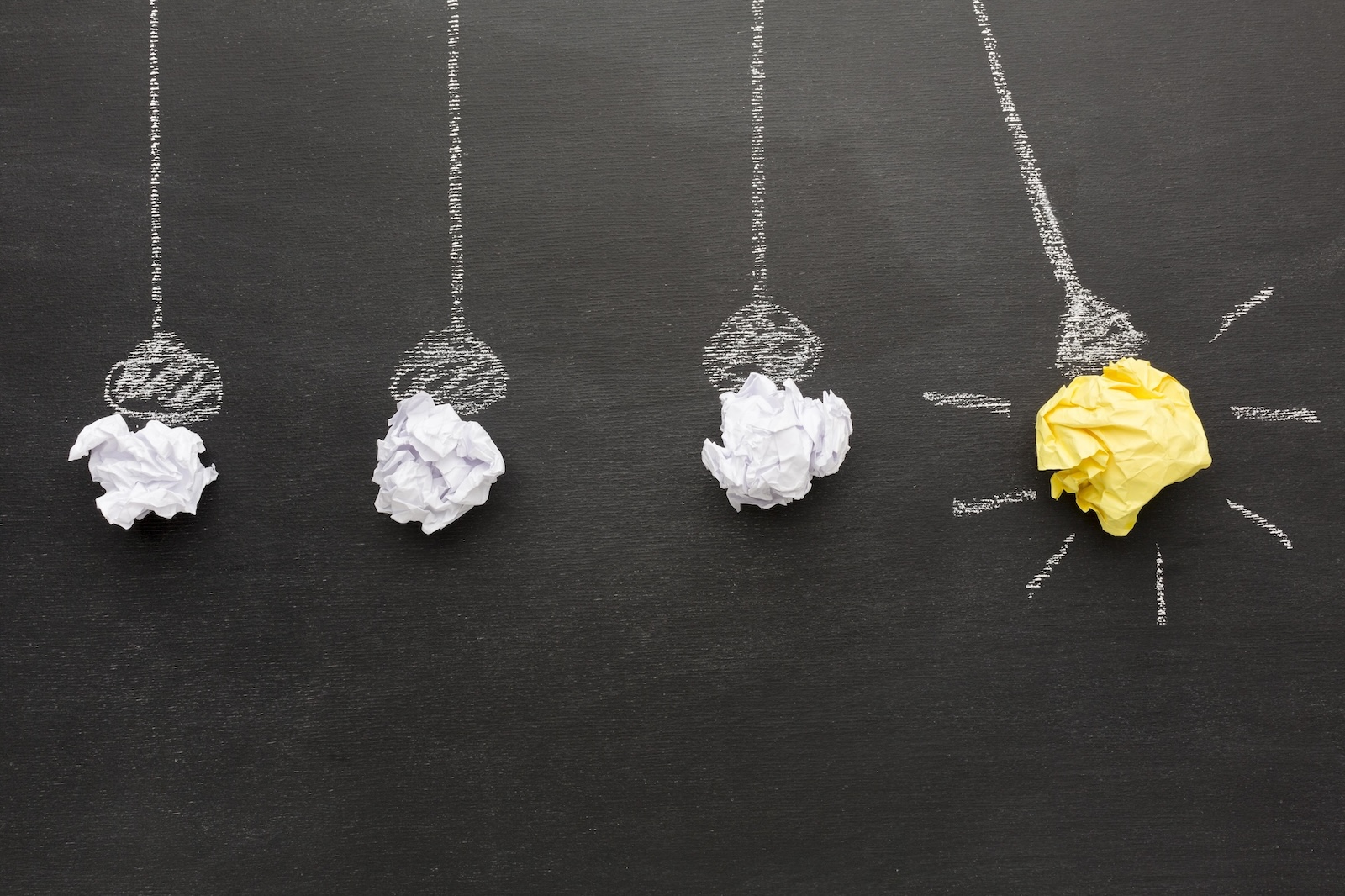
Even the small details matter
5/9/2024, Václav Lang
Choosing an attractive design for your website. Fonts, colors, layout... all these factors determine the success or failure of your digital project. Join us in exploring the secrets of web design.
What design should you choose for your website?
It's no coincidence that McDonald’s chose red and yellow for their visual identity. It's proven that these two colors stimulate appetite. Colors influence us much more than it might seem at first glance. The same goes for other design elements of your website or application.
At NITTIN, we’ve prepared a guide to ensure you don’t overlook even the smallest detail when shaping your requirements, which can ultimately determine the success or failure of your project.
A well-chosen design can affect the impression your website or app makes on users and their subsequent behavior.
How to choose the right font?
There are countless fonts and shades, just as there are countless purposes for using them. That's why you should take your time when selecting them. For example, with fonts, you’ll find that small details, such as whether a font is serif or sans-serif, significantly affect the formality of the environment. Everyone can instantly recognize that a website using Times New Roman looks more serious than anything written in Comic Sans. It’s essential to match the font to the content; if you use a "playful" font for serious content, it would appear chaotic, unprofessional, and definitely not trustworthy. Conversely, an overly "serious" font could completely disrupt the tone of a more light-hearted website.
In typography, serifs are referred to as "serif" fonts, and generally, their presence emphasizes a more serious and formal tone. For such purposes, we recommend fonts like Times or Georgia and their derivatives. They are traditional and may be suitable for news websites or academic pages.
On the other hand, sans-serif fonts, such as Arial, Helvetica, or Roboto, are clean, easy to read, and modern. Therefore, they are suitable for any less formal websites or applications.
There are also various creative fonts—ranging from handwritten styles to outright wild ones reminiscent of punk or metal band logos. Use these sparingly. They may seem interesting and attention-grabbing at first glance, but the primary focus should again be on the reading, and thus the user experience. If you plan to publish texts, it’s better to choose classic, simple fonts that won’t tire the reader.
How to choose the right color for your website?
This is related to the selection of colors. It's not just about the color palette representing your brand, but also ensuring it is legible on screens. Make sure that there is sufficient contrast between text and background; otherwise, the environment may be uncomfortable for users. Limit the color palette to key colors that represent your brand. Sometimes less is more.
Keep in mind that color schemes can affect users' mood. For example, blue can evoke trust and professionalism, while red can signify passion or urgency.
Symbolism of Colors
Red: It can signify passion, love, or urgency. It is also often associated with appetite and stimulates hunger.
Yellow: Represents joy, happiness, and energy. Suitable for websites or applications aiming to highlight positive aspects.
Green: Symbolizes nature, health, and sustainability. Suitable for websites related to ecology or wellness.
Blue: Evokes trust, calmness, and professionalism. Often used in finance and healthcare sectors.
Purple: Can denote luxury, royalty, and mystique. Often utilized in the fashion and cosmetics industries.
Black: Signifies elegance and strength.
Remember, the selection of fonts and colors should align with the goal and message of your website or application, considering the needs of your target audience. The most important thing is for the design to enhance the overall user experience and facilitate navigation on your pages.
Layout
Do you have an idea? Contact us
If you already know that you'd like to turn any of these ideas into reality, feel free to reach out to us. At NITTIN, we build websites for large companies with global impact as well as for individuals. We specialize in platforms like Strapi and Kentico, but we're also open to customized solutions.
We'd love to discuss your ideas over a coffee. Just contact us using the form below.
Other articles
Are you looking for a partner or have a question?
Contact us, we look forward to meeting you in person or over a call.
Contact
+420 603 202 729obchod@nittin.cz NITTIN s.r.o.
Branická 26/43
147 00 Praha 4 IČO: 06947743
DIČ: CZ06947743