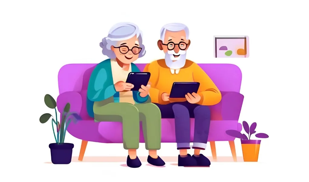
What is Web Accessibility and Why Is It Important?
11/8/2024, Milan Ugrin
Today, we’ll look at web development from a different perspective, one that is often overlooked and many don’t even realize.
Web accessibility ensures that content is accessible to all users, including those with disabilities and other limitations. Adhering to accessibility standards also has a significant impact on a website’s success in search engines today.

What is web accessibility?
The goal of web accessibility is to make websites easy to use for the widest possible range of users. We must remember that users with limited vision, hearing, or motor skills also want to access information, communicate, or shop online as comfortably as others.
Why is web accessibility important?
We’ve outlined 4 key reasons why accessibility is essential for the success of your website:
- Access for All: An accessible website means it serves everyone who wants to use it.
- Better User Experience: An accessible website has a clear structure, intuitive navigation, and a more organized design. Every user will appreciate this.
- SEO Benefits: Accessible websites have well-structured HTML, image descriptions, and clear content, which helps search engines better understand and index the page content.
- Legal Requirements: In some countries, complying with accessibility standards is a legal obligation, especially for public institutions and large companies.
Web Content Accessibility Guidelines (WCAG)
The accessibility standards are defined by WCAG (Web Content Accessibility Guidelines), a set of rules developed by the W3C (World Wide Web Consortium). These guidelines specify how websites should be designed to be accessible to the broadest range of users, including those with disabilities.
The key principles of WCAG are: Perceivability, Operability, Understandability, and Robustness. For more details on WCAG, you can visit the W3C website.
Basic steps to improve accessibility.
Alt text for images.
Each image should have a descriptive alt text that helps users with visual impairments as well as search engines understand what the image represents.
<img src="profil.jpg" alt="Profile picture of John Smith">
Keyboard navigation
A website must be usable even on a computer without a mouse or trackpad. A basic accessibility rule is that users should be able to navigate between elements on the page using the Tab key and interact with them (e.g., click a button) using the Enter key or the spacebar.
Clear heading structure
Follow a logical heading sequence (<h1>, <h2>, etc.) to correctly define the content hierarchy, making it easier for screen readers and search engines to understand the structure of the page.
<h1>Main Heading</h1>
    <h2>Section Heading</h2>
        <h3>Subheading of Section</h3>
        <h3>Another Subheading of Section</h3>
    <h2>Another Section Heading</h2>
Forms with labels
Each form field should have a clear label using the <label> tag, so users know what to fill in.
High color contrast
Always use high color contrast to ensure text and buttons are easily readable for users with color blindness or other visual impairments. It is recommended to have a contrast ratio of at least 4.5:1 between the text color and the background color.
Další aspekty přístupnosti
In this article, we’ve covered what web accessibility is and focused on the basics. However, there are many other important areas that we could explore in more detail:
- ARIA (Accessible Rich Internet Applications) – How to improve accessibility for dynamic applications.
- Forms – How to properly label and structure forms for screen readers.
- Accessibility for people with visual impairments – What types of visual impairments exist and how to adapt your website.
- Accessibility for people with hearing impairments – Captions and alternative transcriptions for audio content.
We’ll dive deeper into these topics another time! 👋
Summary
Accessibility is not just about expanding reach to a wider audience, but also about enhancing the user experience and improving the quality of the website. At NITTIN, we view accessibility as a standard and believe that every page can be a place that welcomes all users – let’s work together to create websites for everyone!
Other articles
Are you looking for a partner or have a question?
Contact us, we look forward to meeting you in person or over a call.
Contact
+420 603 202 729obchod@nittin.cz NITTIN s.r.o.
Branická 26/43
147 00 Praha 4 IČO: 06947743
DIČ: CZ06947743